Statistic 101 with python using drilling data
I have always loved statistic, it was among my most favorite subject when I did my bachelor and master. In my most recent master thesis, I applied statistical quantitative approach in order to justify the effect of entrepreneurial activities relative to income inequality in 70 different countries. Some people may think it’s boring, but I simply adore how one can generate patterns of information solely from a bunch of numbers in a table form. The more you dig into, the more you discover the hidden layers of information underneath. There is no right or wrong, it is just a question of which method would you like to associate your argument with. Perhaps that is the reason it becomes captivating, the fact that you could not manipulate details inside statistic? It is so pure and honest.
Back in university, I normally used SPSS package to run statistical analysis. Now that I don’t own any license of it, I challenged myself to use python instead. It is not easy at all obviously, however i believe it is the learning process that matter. Here I would like to share with you my starting journey of statistical analysis with python library in statistic such as Sci-kit and Matplotlib. Statsmodels comes handy too when it comes to advanced statistic. I will apply all these library in the study case to give general idea of how python can be used to interpret statistical data ![]() .
.
Basic linear regression step-by-step
1. Create a scatter-plot
In order to establish an assumption, we must first identify a scenario where our independent variable could potentially impose a positive or negative relationship to our dependent variable. One of the easiest way to find such relationship is by recognizing the trend exists in a scatter plot.
I plotted few random drilling parameters taken from a dummy well. The file is originally in .LAS then I converted and prepared it in .xlsx format hence we can utilize dataframe pandas to read the excel file. In this case, I would like to test hypothesis that Rate of Penetration (ROP) is directly depending on the Rotation per Minute (RPM) or Weight on Bit (WOB).
 |
|---|
| Courtesy from https://towardsdatascience.com/linear-regression-in-python-9a1f5f000606 |
import matplotlib.pyplot as plt
import pandas as pd

df = pd.read_excel("/Users/berthaamelia/Documents/Python/sample/dummy_well.xlsx")
df["DATETIME"]= pd.to_datetime(df["DATETIME"])

plt.subplot(211)
plt.scatter(x= df["Bit_Weight"], y=df["ROP_-_Average"], c=df["DHT001_Depth", alpha=0.5, label= "colorbar=DHT001 Depth")
plt.title("surface WOB vs. ROP", fontsize=10)
plt.colorbar()
plt.legend()

plt.subplot(212)
plt.scatter(x= df["Top_Drive_RPM"], y=df["ROP_-_Average"], c=df["DHT001_Depth"], alpha=0.5)
plt.title("surface RPM vs. ROP", fontsize=10)
plt.colorbar()
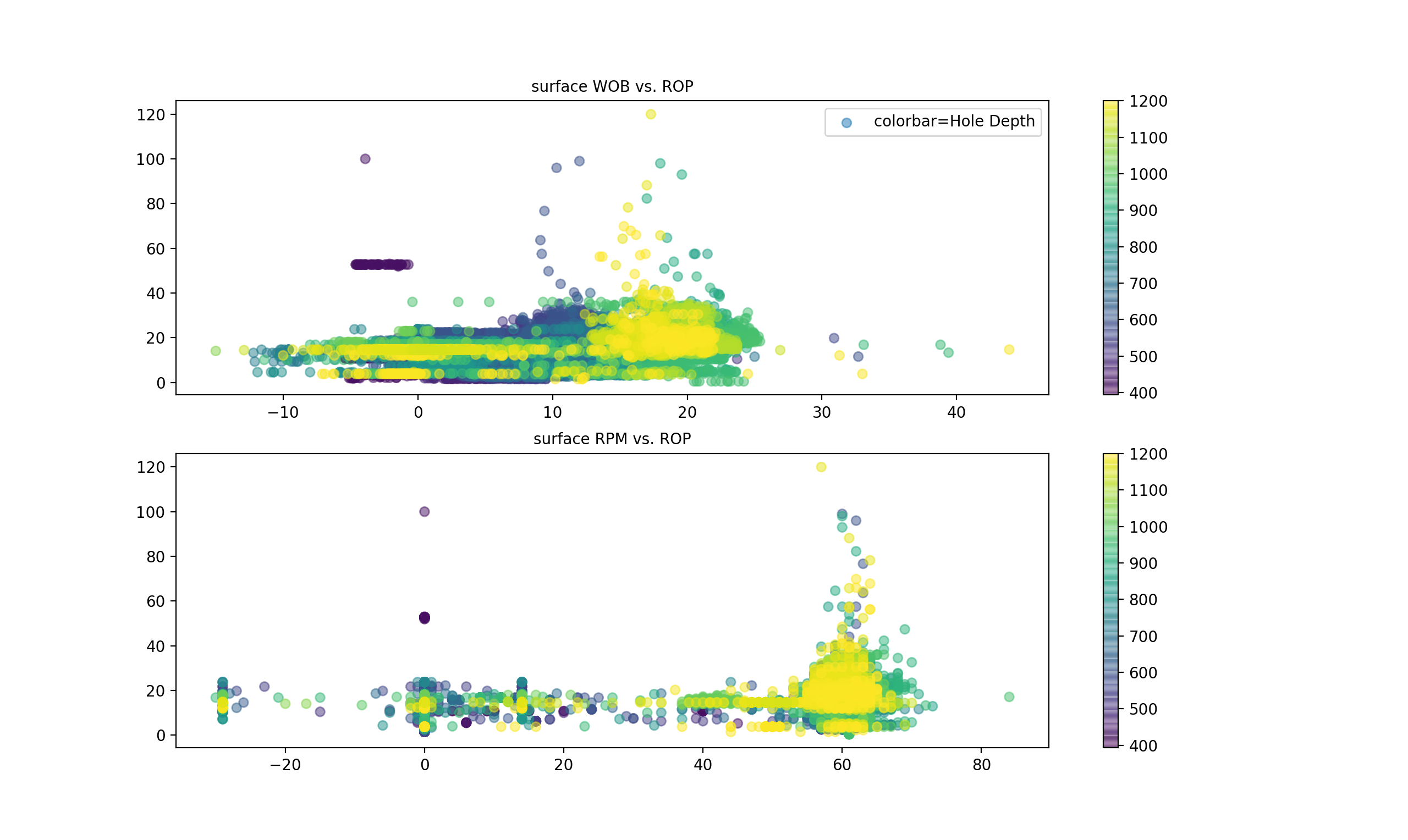
The number (211) refers to no.of row=2, no.of column=1 and the last digit is where you want to place your current plot.
Matplotlib.pyplot receives parameters as such:
x= x-axis (surface WOB and RPM)
y= y-axis (ROP)
s= size
c= color
alpha = 0.5 (transparency).
I am using the channel “Hole Depth” as the colorscale. You can as well play around with different colorscale, you may also assign a channel as the size reference too.
2. Establish simple linear regression chart
As we see in the scatter-plot above, there seems to be a cluster of data towards the ROP. Although it is not exclusively apparent, we may want to establish a linear regression model to test whether our hypothesis is statistically significant or not. To do so I will use the module sklearn and import its linear model.
import matplotlib.pyplot as plt
import pandas as pd
import seaborn as sns
import numpy as np
sns.set_style("whitegrid") #Use seaborns module for better visualisation

df = pd.read_excel("/Users/berthaamelia/Documents/Python/sample/dummy_well.xlsx", index=None)

#Convert all data into numpy 2-dimensional
x = np.array(df["Bit_Weight"]).reshape((-1, 1))
x2 = np.array(df["Top_Drive_RPM"]).reshape((-1, 1))
y = np.array(df["ROP_-_Average"])

model_WOB = LinearRegression().fit(x, y)
model_RPM = LinearRegression().fit(x2, y)
r_sq_WOB = model_WOB.score(x, y)
r_sq_RPM = model_RPM.score(x2, y)

#Print R-squared, gradient and intercept values for each regression
print('coefficient of determination:', r_sq_WOB) #This is R-squared
print('intercept:', model_WOB.intercept_) #This represents B0
print('slope:', model_WOB.coef_) #This represents the slope, or coefficient B1

print('coefficient of determination:', r_sq_RPM)
print('intercept:', model_RPM.intercept_)
print('slope:', model_RPM.coef_)

fig,axs = plt.subplots(ncols=2)
sns.regplot(x= df["Bit_Weight"],y= df["ROP_-_Average"], data= df,scatter_kws={'alpha':0.5}, line_kws={'color': 'red'}, ax=axs[0])
sns.regplot(x= df["Top_Drive_RPM"],y= df["ROP_-_Average"], data= df,scatter_kws={'alpha':0.5}, line_kws={'color': 'red'}, ax=axs[1])
plt.show()
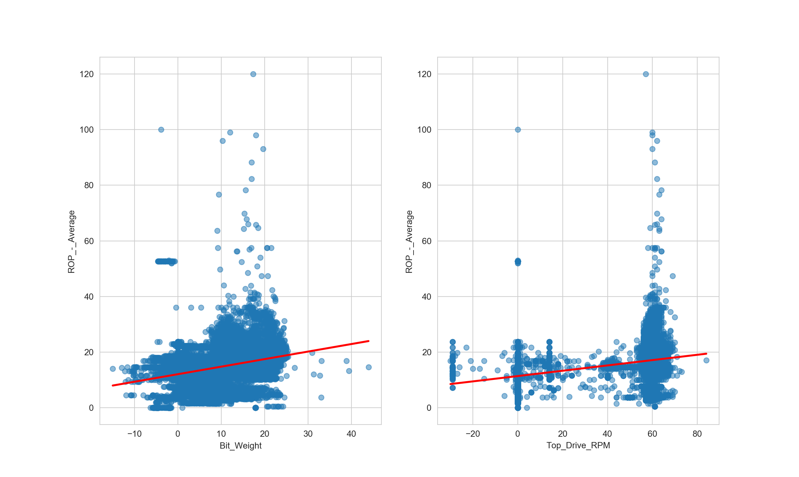
Result for surface WOB:
| coefficient of determination (R2) | 0.11853302650679276 |
|---|---|
| intercept (β0) | 12.077543082954572 |
| slope (β1) | 0.27129165 |
Result for surface RPM:
| coefficient of determination (R2) | 0.18675176285206874 |
|---|---|
| intercept (β0) | 11.41033600398227 |
| slope (β1) | 0.09560672 |
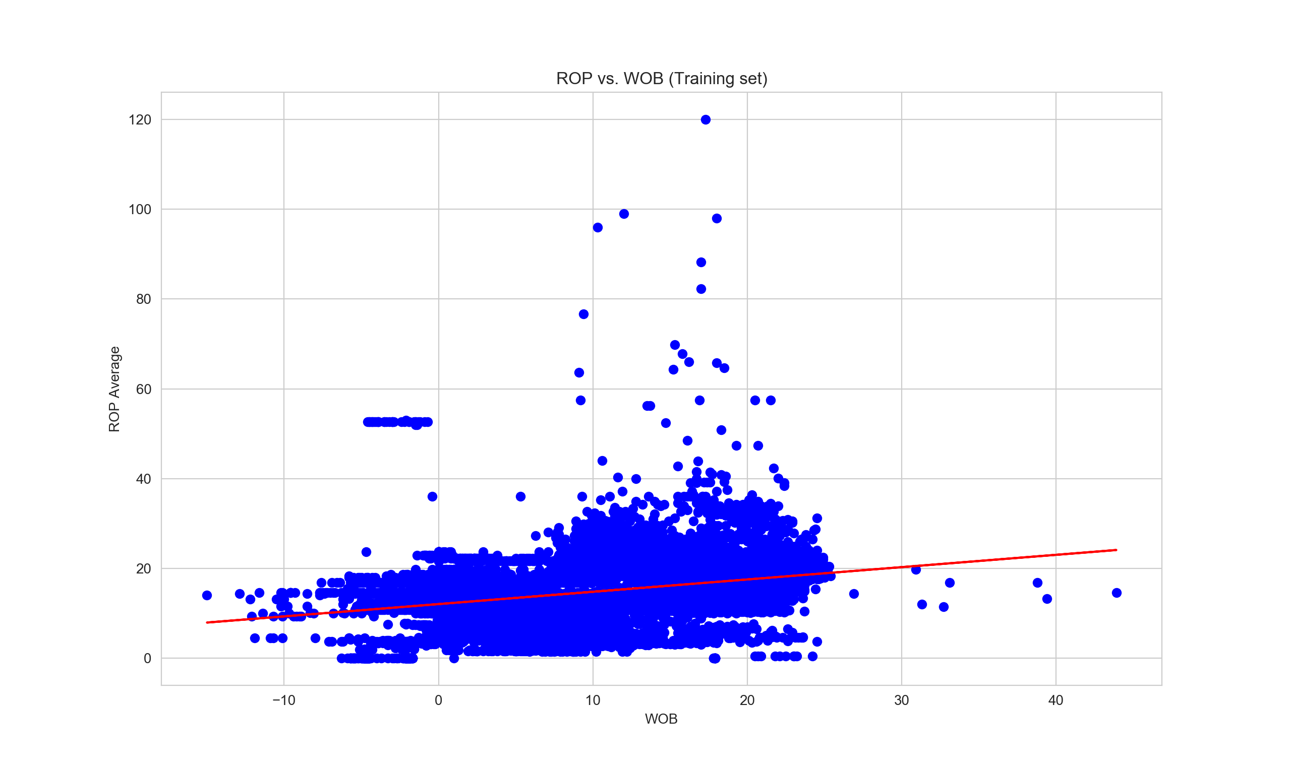
3. Predict response using training set
Now that we have generated our linear regression model, we proceed with testing the model using some random data. For this purpose we will need to split the data, we will use 80% of total data as training dataset and 20% as testing dataset.
Let us first test the regression model one by one in order to avoid confusion when coding. Start with the first model where surface WOB is the independent variable and ROP is our dependent variable, we want to test whether the model is sufficient enough to predict ROP average based on WOB parameter. Then we will compare the result with another model where surface RPM is the predictor.
import matplotlib.pyplot as plot
import pandas as pd
import seaborn as sns
import numpy as np
sns.set_style("whitegrid")
from sklearn.linear_model import LinearRegression
df = pd.read_excel("/Users/berthaamelia/Documents/Python/sample/dummy_well.xlsx", index=None)
df["DATETIME"]= pd.to_datetime(df["DATETIME"])
x = np.array(df["Bit_Weight"]).reshape((-1, 1)) #reshape into 2-D numpy data
y = np.array(df["ROP_-_Average"])
from sklearn.model_selection import train_test_split
xTrain, xTest, yTrain, yTest = train_test_split(x, y, test_size = 0.2, random_state =0) #Here we assign 20% of total data as test dataset &
#80% as train dataset
linearRegressor = LinearRegression()
linearRegressor.fit(xTrain, yTrain)
yPrediction = linearRegressor.predict(xTest)
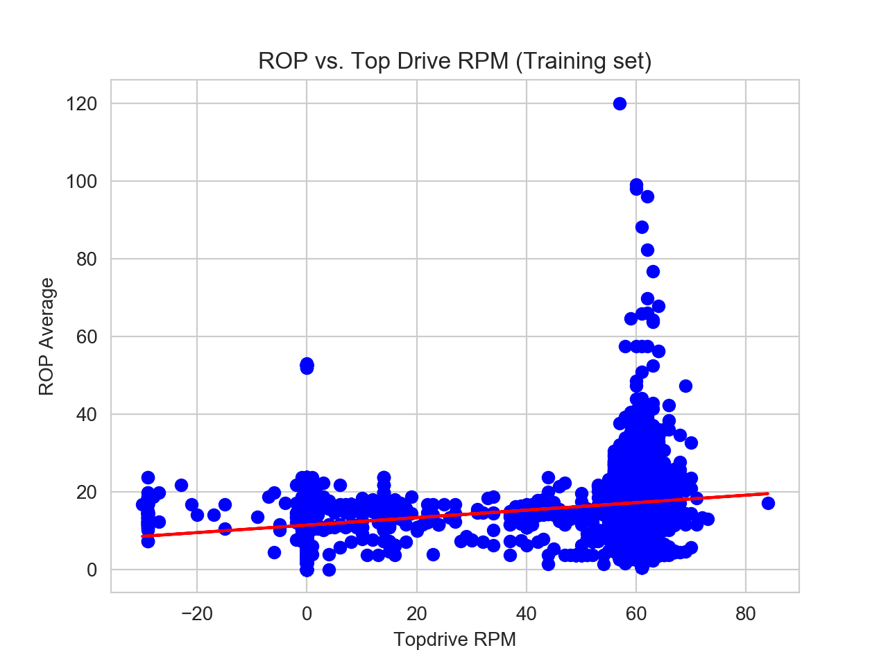
plot.scatter(xTrain, yTrain, color = 'blue')
plot.plot(xTrain, linearRegressor.predict(xTrain), color = 'red')
plot.title('ROP vs. WOB (Training set)')
plot.xlabel('WOB')
plot.ylabel('ROP Average')
plot.show()
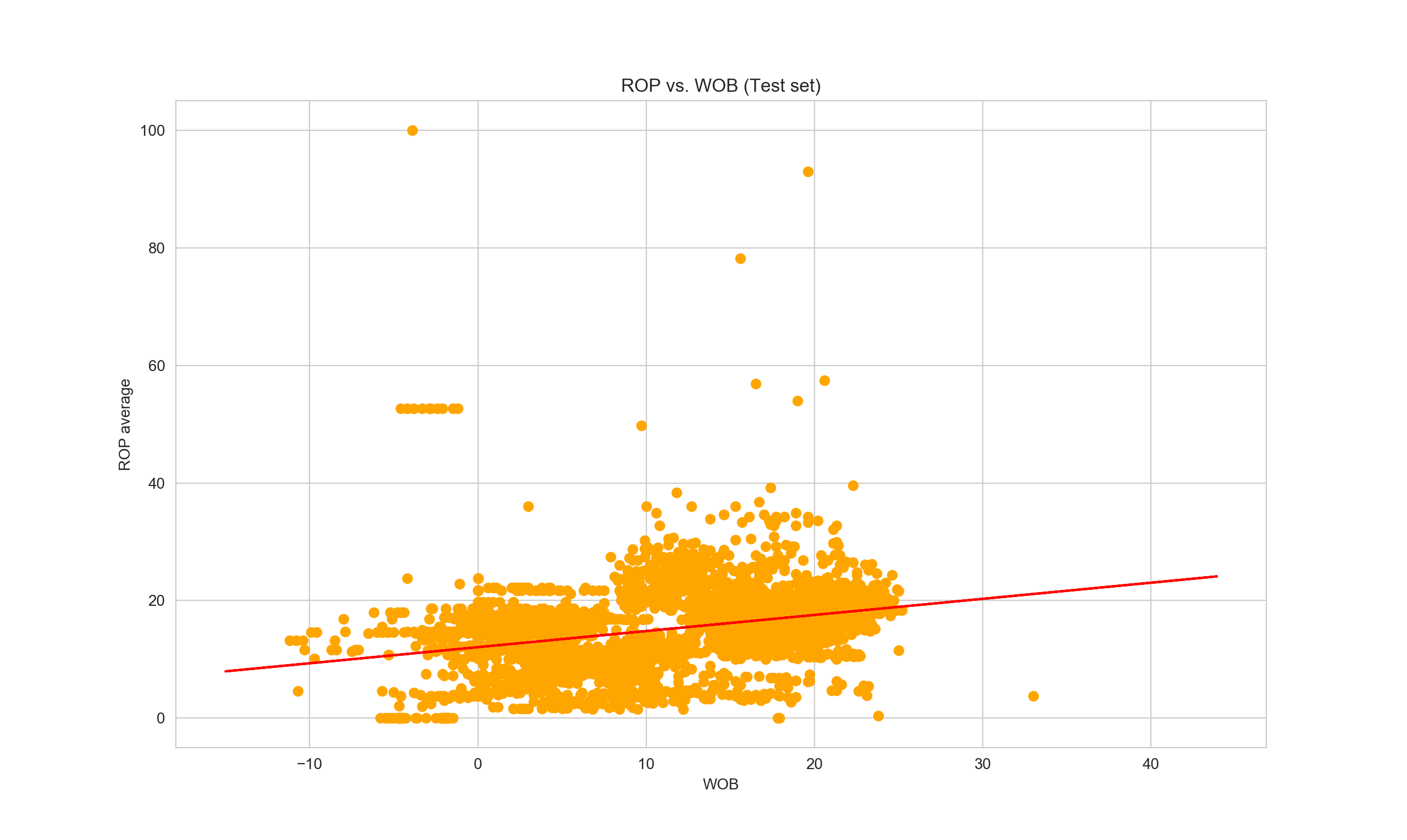
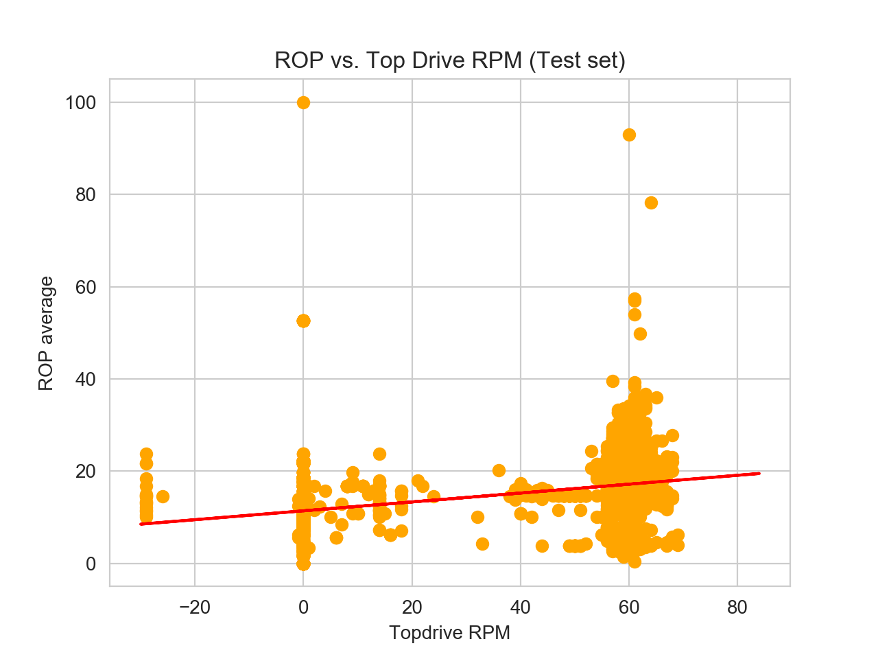
plot.scatter(xTest, yTest, color = 'orange')
plot.plot(xTrain, linearRegressor.predict(xTrain), color = 'red')
plot.title('ROP vs. WOB (Test set)')
plot.xlabel('WOB')
plot.ylabel('ROP average')
plot.show()
Now if we want to print the first five values of our x-test data and generate the predicted-y, we can add the following line:
print("X=%s, Predicted=%s" % (xTest[:5], yPrediction[:5]))
#It will print out:
#/usr/local/bin/python3.7 /Users/berthaamelia/Documents/#Python/sample/linear_reg.py
#X=[[11.6]
# [ 7.8]
# [23. ]
# [22.6]
# [20.3]], Predicted=[15.25509899 14.21339632 18.380207   18.27055409 17.#64004984]
This implies, when WOB is 11.6, the ROP average is estimated to be 15.25 based on current model. How good is our model actually as compared to the real y-values? Here we can try to display the comparison between actual vs. predicted y-values in dataframe format.
df_test = pd.DataFrame({'Actual': yTest, 'Predicted': yPrediction})
print(df_test)
#It will print out:
#       Actual  Predicted
#0       2.93  15.255099
#1       5.98  14.213396
#2      19.16  18.380207
#3       4.62  18.270554
#4      10.28  17.640050
#...      ...        ...
#4601   12.88  16.680587
#4602    3.22  12.212231
#4603   14.63  13.774785
#4604   14.60  12.075165
#4605   21.73  13.226520
#
#[4606 rows x 2 columns]
Now let us generate training and testing data set for topdrive RPM data. In this case, it will be exactly the same block code as writtent above, the difference is we change x variable into “Top Drive RPM”.
x = np.array(df["Top_Drive_RPM"]).reshape((-1, 1))
y = np.array(df["ROP_-_Average"])
4. Determining error
Now that we have run brief analysis on both our predictors: WOB and topdrive RPM to estimate the average ROP, we need to evaluate the performance of our algorithm on particular dataset. It would be hard to judge simply by looking at the difference in predicted-y values on both predictors. Thus, an easier way to asses which model performs better is by looking at the error. To do that, we will use the evaluation metrics module from sklearn.
from sklearn import metrics
print('Mean Absolute Error:', metrics.mean_absolute_error(yTest, yPrediction))
print('Mean Squared Error:', metrics.mean_squared_error(yTest, yPrediction))
print('Root Mean Squared Error:', np.sqrt(metrics.mean_squared_error(yTest, yPrediction)))
| Name | surface WOB | surface RPM | Interpretation |
|---|---|---|---|
| Mean Absolute Error (MAE) | 4.125982092922794 | 3.7542304735761456 | The mean of the absolute value of the errors. This is simply calculating mean of the difference between prediction and actual observation. |
| Mean Squared Error (MSE) | 35.622605808248416 | 32.938404440623884 | The mean of the squared errors. |
| Root Mean Squared Error (RMSE) | 5.968467626472344 | 5.73919893718835 | The square root of the mean of the squared errors. |
RMSE is the most popular metric and commonly used to interpret statistical data error. The RMSE for topdrive RPM is slightly less than RMSE for WOB, implying the predicted-y values for RPM are closer to the actual values, thus suggesting a better fit regression than the WOB.
5. [Extra] Advanced linear regression with statsmodels
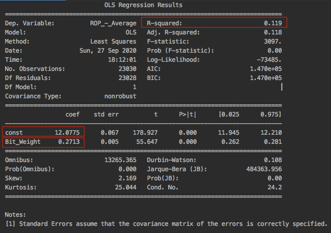
If you fancy SPSS just like me, you would appreciate the statsmodels package in python library. It provides a more comprehensive result and sophisticated look as compared to traditional scikit. Here is the example of runing statsmodels linear regression using the same data set for surface WOB.
import pandas as pd
import statsmodels.api as sm

df = pd.read_excel("/Users/berthaamelia/Documents/Python/sample/dummy_well.xlsx", index=None)
df["DATETIME"]= pd.to_datetime(df["DATETIME"])

x = df["Bit_Weight"]
y = df["ROP_-_Average"]

#add constant manually to X
x = sm.add_constant(x)
model = sm.OLS(y,x).fit()
predictions = model.predict(x)
print(model.summary())
Now if we compare the statistical results from statsmodels with scikit library, we obtained exactly the same results. R-squared is 0.119, const refers to the intercept which is 12.0775 and Bit_Weight refers to the slope which is 0.2713.
Interpretation of regression results
| Name | Interpretation |
|---|---|
| R2 | Reflects the fit of the model. R-squared values range from 0 to 1, where a higher value generally indicates a better fit, assuming certain conditions are met. |
| Intercept | It means that when surface WOB or surface RPM coefficients are zero, then the expected output (i.e., the average ROP) would be equal to the Y-intercept. |
| Slope | represents the change in the output Y due to a change of one unit in the surface WOB parameter (everything else held constant). |
| std err | reflects the level of accuracy of the coefficients. The lower it is, the higher is the level of accuracy. |
| P >t is your p-value | A p-value of less than 0.05 is considered to be statistically significant. |
| Confidence Interval | represents the range in which our coefficients are likely to fall (with a likelihood of 95%). |
| Courtesy from https://datatofish.com/statsmodels-linear-regression/ |
Reading source:
https://www.kdnuggets.com/2019/03/beginners-guide-linear-regression-python-scikit-learn.html
https://stackabuse.com/linear-regression-in-python-with-scikit-learn/